Toolbar
Three toolbar components for different positions and purposes.
Figma Mockups
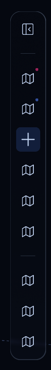
Vertical Toolbar
The main sidebar toolbar with grouped icon buttons.
Preview
Rendered in WASM — scroll may behave differently from the rest of the pageUsage
rust
use ui_theme::components::toolbar::{toolbar, ToolbarItem, ToolbarGroup};
use ui_theme::icons::*;

let groups: Vec<ToolbarGroup> = vec![
  vec![
      ToolbarItem::new(ICON_LAYERS),
      ToolbarItem::new(ICON_MAP),
  ],
  vec![
      ToolbarItem::new(ICON_SETTINGS),
  ],
];

let response = toolbar(ui, &theme, &groups, Some(0), &[]);
Top Toolbar
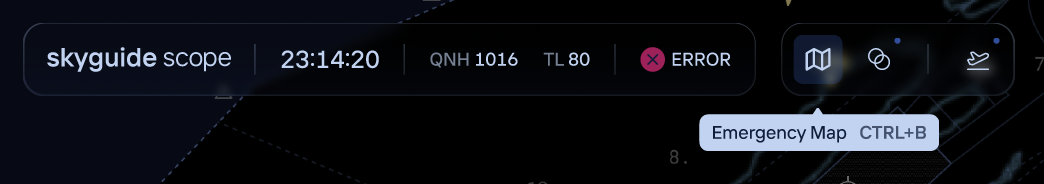
A horizontal toolbar with title, clock, and icon buttons.
rust
use ui_theme::components::top_toolbar::top_toolbar;
use ui_theme::icons::*;

let response = top_toolbar(
  ui, &theme,
  "APP TITLE", "12:34:56", "QNH 1013", "TL 60",
  None,
  &[ICON_SETTINGS, ICON_SEARCH],
);
Zoom Toolbar
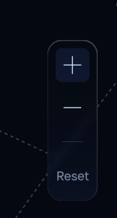
Compact zoom controls with +/- and reset.
rust
use ui_theme::components::zoom_toolbar::zoom_toolbar;
use ui_theme::icons::*;

let response = zoom_toolbar(ui, &theme, rect, ICON_PLUS, ICON_MINUS);