Button
A clickable control that triggers an action. Supports Primary, Secondary, Ghost, Outline, Destructive, and Link variants.
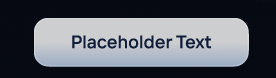
Figma Mockup
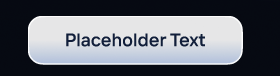
Preview
Rendered in WASM — scroll may behave differently from the rest of the pageUsage
rust
use ui_theme::components::button;
use ui_theme::{ControlVariant, ControlSize};

button(ui, &theme, "Click me", ControlVariant::Primary, ControlSize::Md);
Props
| Prop | Type | Default | Description |
|---|---|---|---|
ui | &mut Ui | required | The egui UI context |
theme | &Theme | required | Theme instance |
label | impl Into<WidgetText> | required | Button text |
variant | ControlVariant | Primary | Visual variant |
size | ControlSize | Md | Button size |
Variants
| Variant | Description |
|---|---|
Primary | Filled blue — primary actions |
Secondary | Subtle fill — secondary actions |
Ghost | Transparent — tertiary actions |
Outline | Border only — alternative secondary |
Destructive | Red — dangerous actions |
Link | Text only — navigation actions |