Tabs
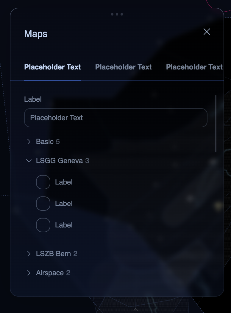
A horizontal tab bar with an animated underline indicator. The active tab has bright text and a ring-colored underline that expands from center. Inactive tabs show muted text.
Figma Mockup
Preview
Rendered in WASM — scroll may behave differently from the rest of the pageUsage
rust
use ui_theme::components::tabs;

let mut selected = 0;
tabs(ui, &theme, &mut selected, &["Layers", "Filters", "Settings"]);

// Use selected index to switch content
match selected {
  0 => { ui.label("Layers content"); }
  1 => { ui.label("Filters content"); }
  2 => { ui.label("Settings content"); }
  _ => {}
}
With Icons
rust
use ui_theme::components::tabs_with_icons;
use ui_theme::icons::{ICON_STAR, ICON_SEARCH};

let mut selected = 0;
tabs_with_icons(
  ui, &theme, &mut selected,
  &["Favorites", "Search", "All"],
  &[Some(ICON_STAR), Some(ICON_SEARCH), None],
);
Props
| Prop | Type | Default | Description |
|---|---|---|---|
ui | &mut Ui | required | The egui UI context |
theme | &Theme | required | Theme instance |
selected | &mut usize | required | Currently selected tab index |
labels | &[&str] | required | Tab labels |
icons | &[Option<char>] | &[] | Optional per-tab Lucide icon (tabs_with_icons only) |