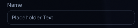
Text Input
A single-line text input with consistent styling across sizes.
Figma Mockup
Preview
Rendered in WASM — scroll may behave differently from the rest of the pageUsage
rust
use ui_theme::components::text_input;
use ui_theme::ControlSize;

let mut text = String::new();
text_input(ui, &theme, &mut text, ControlSize::Md);
Search Bar Example
Compose a search bar with a Lucide icon, text input, and a clear button:
rust
use ui_theme::icons::{icon_text, ICON_SEARCH, ICON_CIRCLE_X};

ui.horizontal(|ui| {
  ui.set_height(28.0);
  ui.spacing_mut().item_spacing.x = theme.spacing.sm;

  // Search icon
  ui.add_sized(
      egui::vec2(16.0, 28.0),
      egui::Label::new(
          icon_text(ICON_SEARCH, 16.0).color(theme.palette.muted_foreground),
      ),
  );

  // Text input
  let remaining = ui.available_width()
      - if text.is_empty() { 0.0 } else { 24.0 };
  ui.add_sized(
      egui::vec2(remaining, 28.0),
      egui::TextEdit::singleline(&mut text)
          .hint_text(
              egui::RichText::new("Search...")
                  .color(theme.palette.muted_foreground)
                  .size(12.0),
          )
          .font(egui::FontId::proportional(12.0))
          .text_color(theme.palette.foreground),
  );

  // Clear button (only when text is non-empty)
  if !text.is_empty() {
      let clear = ui.add(
          egui::Button::new(
              icon_text(ICON_CIRCLE_X, 16.0)
                  .color(theme.palette.muted_foreground),
          )
          .frame(false),
      );
      if clear.clicked() {
          text.clear();
      }
  }
});
Props
| Prop | Type | Default | Description |
|---|---|---|---|
ui | &mut Ui | required | The egui UI context |
theme | &Theme | required | Theme instance |
text | &mut impl TextBuffer | required | Mutable text buffer |
size | ControlSize | Md | Input size |